Codifying Architecture: Diagrams as Code

(Originally drafted in August 2019 during my tenure at Xero. Republished here in March 2024 with updated context and removed proprietary references)
Engineers love writing code. There’s nothing quite like instantly seeing the fruits of your labour appear on a screen – immediate feedback and the joy of getting something working.
Engineers, however, tend to hate writing documentation. It takes time, it’s seen as overhead to “real work,” and so it falls by the wayside. The next engineer to come along is told: “Oh, that’s out of date – just look at the ‘self-documenting’ code instead.”
But what if we could have both? What if we could generate our documentation from code?
The concept of “living documentation” is nothing new, and there’s a plethora of development-related tools - XML-Doc, Sandcastle, Swagger – that help alleviate this overhead.
Architecture Moves Slowly, Then All At Once
Software architecture is a slow-moving beast: lots of little changes introduced at a granular level gradually begin to affect the software at a higher level. Capturing that evolution is exactly where documentation tends to rot fastest.
The C4 model is one popular way to represent a software system, composed of levels that work much like Google Maps:
- Level 1 – System Context (the country): your software system in scope, plus the people and external systems that interact with it. Intended for everybody, technical and non-technical alike.
- Level 2 – Container (state or county): the deployable units inside your system – web apps, APIs, databases. Intended for technical audiences: architects, developers, ops.
- Level 3 – Component (town or village): the internal building blocks of a single container. Intended for architects and developers.
- Level 4 – Code (streets and buildings): the classes, interfaces, functions and tables that make up a component. Also intended for architects and developers.
Here’s the key insight: the lower levels can often be generated directly from code using built-in tooling (Visual Studio, for instance, can generate UML class diagrams from code – though whether you have the processing power for a large monolith is another matter entirely 😉).
The upper levels are much harder to automate. Network calls, infrastructure, service boundaries, data formats, domain boundaries, user interactions, technology diversity – there’s vastly more to consider, and full automation tends to produce wildly inaccurate results.
Learning This the Hard Way
When I first tried to map out the architecture of a large system, I did what most people do: hunted down whatever documentation existed (spoiler: it was stale), then interrogated the code to find the network API endpoints and how dependent systems consumed them – not just technically, but from a business perspective too. All of that went into a spreadsheet as a living reference.
Then came the visualisation: a hand-crafted diagram in a drag-and-drop diagramming tool, illustrating how all the system entities connected, interacted, and how end-users engaged with them.
There’s real value in building a visualisation by hand – you develop deep familiarity with the system. But there’s a serious cost, too. When I discovered that another product also depended on this one, I had to move boxes upon boxes, rearrange connector lines, and rethink the entire layout. Every discovery meant painful rework.
Enter PlantUML
The turning point was discovering PlantUML, ideally combined with the C4-PlantUML extension.
PlantUML lets you generate diagrams through code – you define your elements, then link them together much like you’d call methods and pass parameters. The project website may look like it’s from the 90’s, but the software itself has been in continuous development for over a decade – which makes it a pretty safe and reliable bet.
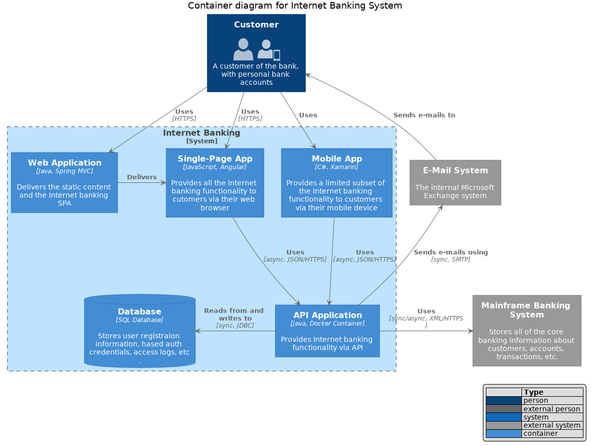
Once installed (a piece of cake on macOS with Homebrew), you can generate diagrams within seconds using a handful of core functions:
| Function | Purpose | Example |
|---|---|---|
Rel | Creates a relationship between two symbols | Rel(webApp, api, "Manages files using") |
Person | Creates a symbol representing a user persona | Person(accountantUser, "Accountant") |
Container | Creates a symbol representing a deployable container | Container(webApp, "Web App", "ASP.NET", "Primary application") |
System_Boundary | Draws a box around containers representing a system’s boundary | System_Boundary(mySystem, "My System") { ... } |
From there you can layer on the rest of PlantUML’s considerable functionality.
Hand-Drawn vs. Diagram-as-Code
Having produced the same Level 1 and Level 2 diagrams both by hand and in PlantUML, I found the comparison illuminating:
| Attribute | Drag-and-Drop Tools (e.g. LucidChart) | PlantUML |
|---|---|---|
| Flexibility | Infinite - customise colours, line styles, everything | Constrained - output can’t be directly controlled, but formatting is consistent |
| Speed | Building diagrams by hand is arduous | Diagrams come together exceptionally quickly |
| Output | Fine-grained control over the final look | Outside your control, though some layout declarations can influence it |
| Versioning | Revision history, but diffs are hard to read | Line-by-line history as plain text in Git |
| Changes | Hard to review others’ changes | Standard pull request review applies |
To be fair, neither tool wins outright – each fits scenarios the other doesn’t. And PlantUML’s auto-layout output isn’t perfect, but it’s an excellent starting point that you can fine-tune with layout hints.
Why Diagrams-as-Code Wins for Me
Three things tipped it decisively for me:
- Iteration speed. When you discover a new dependency or a mislabeled boundary, it’s a two-line edit rather than an afternoon of dragging boxes.
- Reviewability. Diagrams stored as text go through the same PR process as code - changes are reviewed, approved, and versioned line by line.
- Collaboration on future state. Want to explore a target architecture in a workshop? Editing a text file live, rendering in seconds, and iterating on the shape of the future beats hand-redrawing every time. It becomes a cinch.
Beyond the C4 basics, it’s straightforward to extend the vocabulary with domain-specific symbols – queues, topics, sync vs. async services, workers, CLI apps – so your diagrams speak the natural language of your distributed system rather than forcing everything into generic boxes.
Take It Further
Some resources I found useful while getting started:
If your team’s architecture documentation has drifted into “trust me, the code is self-documenting” territory, diagram-as-code is worth an afternoon of your time.
Your future teammates will thank you.
Related Posts
2024-02-18